Simplifying travel claim experience for thousands of Hajj & Umrah travelers.
B2C
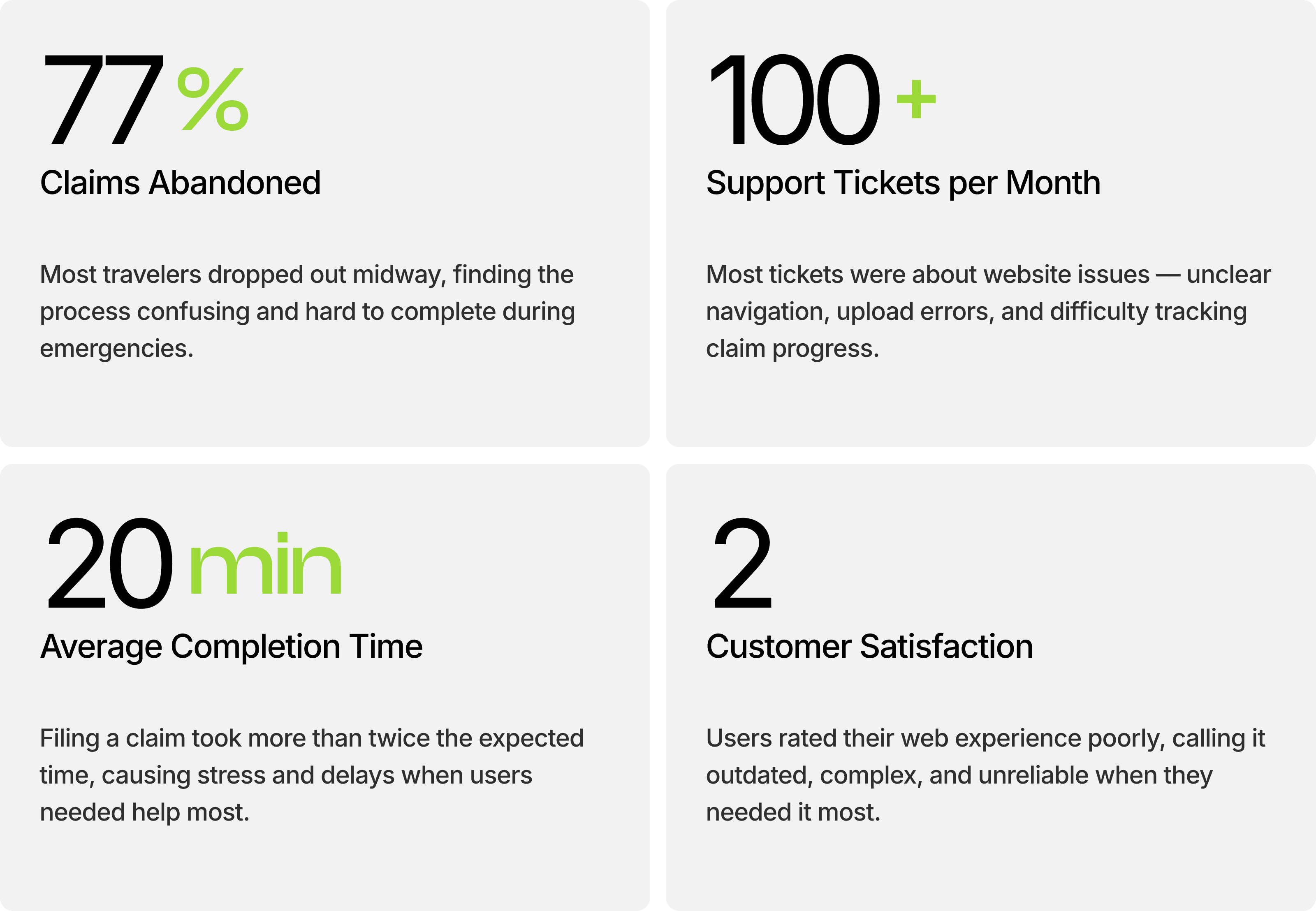
This project focused on redesigning the claim filing experience for a travel insurance company specializing in pilgrimage travelers. The existing claim process had a critical 77% abandonment rate, with users struggling to complete claims during emergencies while traveling.

⚠️ NDA Notice: This project is protected under a non-disclosure agreement. Company name, branding elements, and certain proprietary features have been anonymized or modified to protect confidential information. All metrics, research findings, and design processes presented are authentic representations of the actual project work. Some design visuals have also been intentionally blurred to maintain confidentiality.
// Understanding the challenge
Pilgrimage traveler's often face emergencies far from home, but the existing web-based claim process was slow, confusing, and difficult to complete on mobile devices. Many users abandoned their claims midway, and frustrated customers began suggesting a dedicated mobile app for faster, easier access during critical moments.
"How might we design a mobile-first experience that helps traveler's file and track insurance claims effortlessly, even in times of distress?"
// My Approach
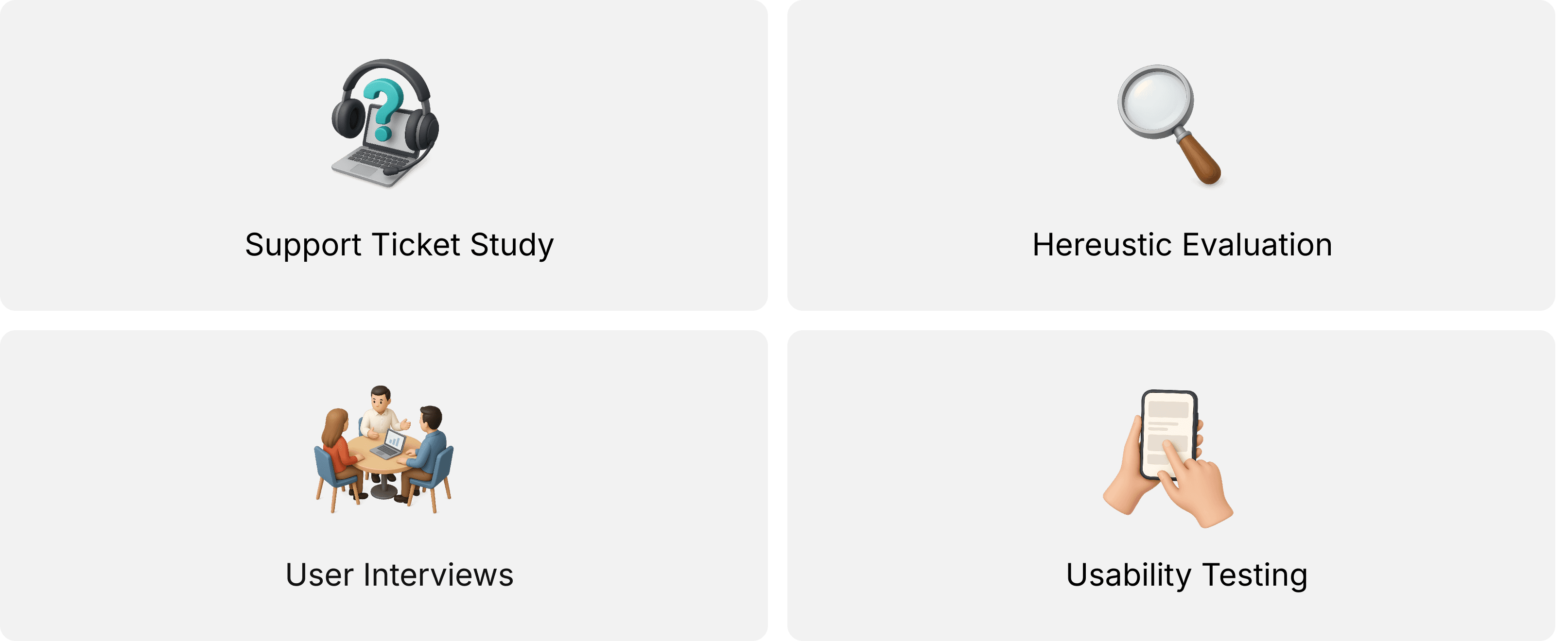
With a tight 6-week timeline and limited budget, I needed to be strategic about research. I have decided to do following things to create new experience.
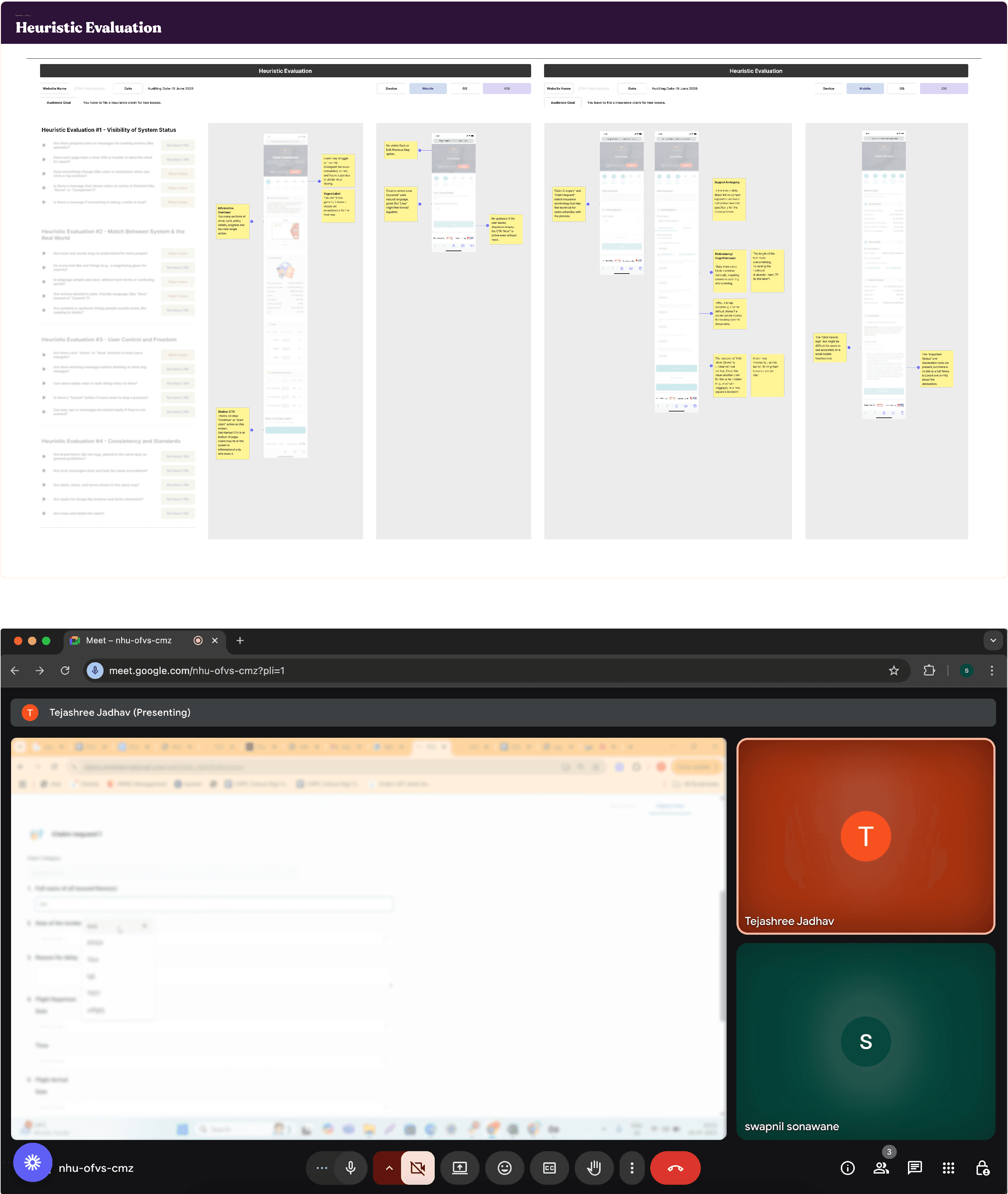
// Heuristic Evaluation
I conducted a comprehensive expert review of the existing claim flow across desktop and mobile, evaluating it against Nielsen’s 10 usability heuristics and WCAG accessibility standards. Additionally, I collaborated with our QC engineer to gain a deeper understanding of the current problems of UI design and identify key areas for improvement.
// Talking to Real Users
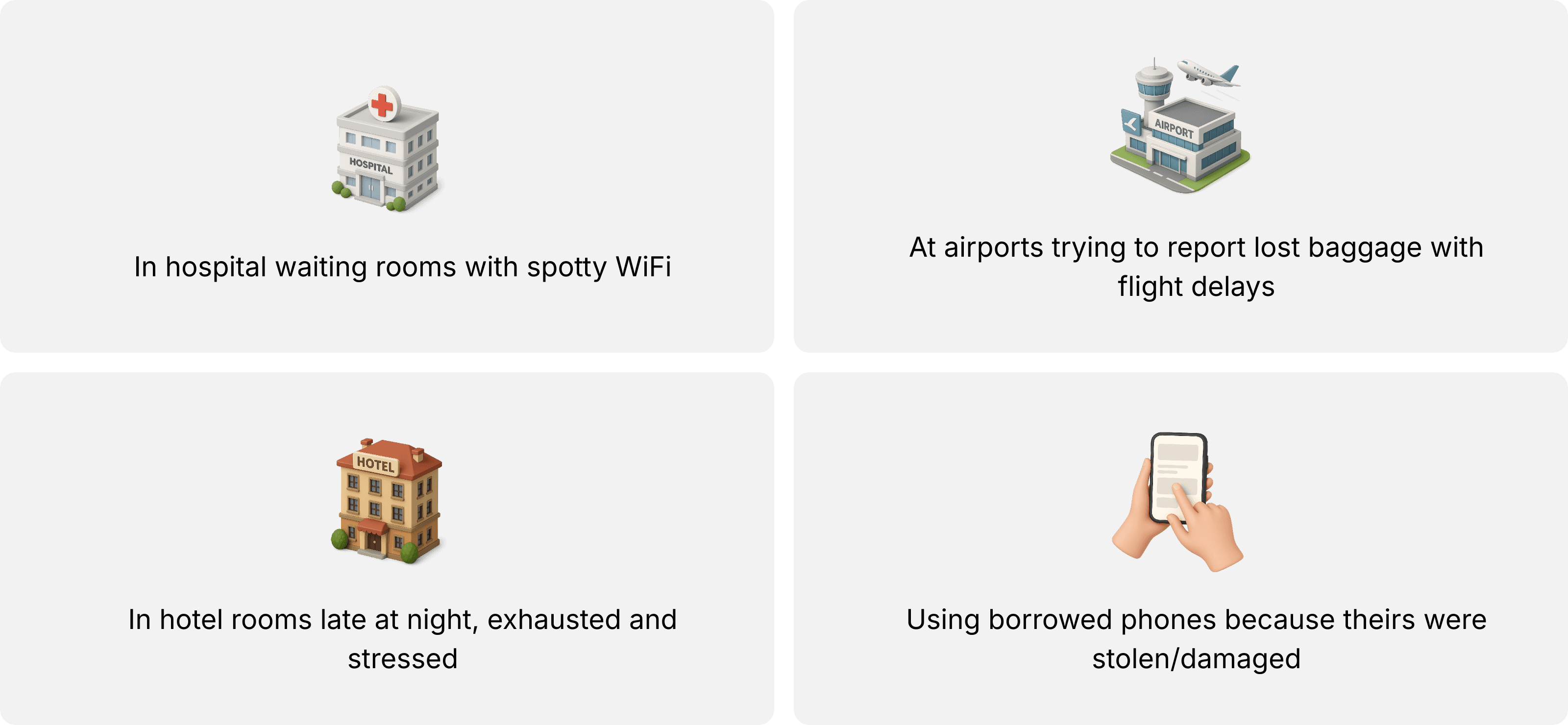
We collaborated with the client’s customer service team to recruit eight participants. Given our limited budget, the client managed outreach and scheduling, while our Customer Success Manager conducted the interviews on-site. What I learned from the user interviews, based on insights shared by my manager was that users weren’t casually filing claims from their couches. They were:
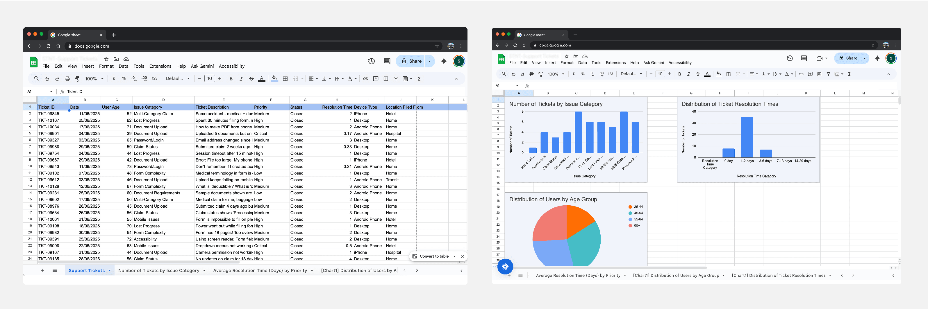
// The insights
Our research revealed a worrying trend, traveler's were spending twice as long trying to complete their insurance claims, often giving up midway when they needed support the most.
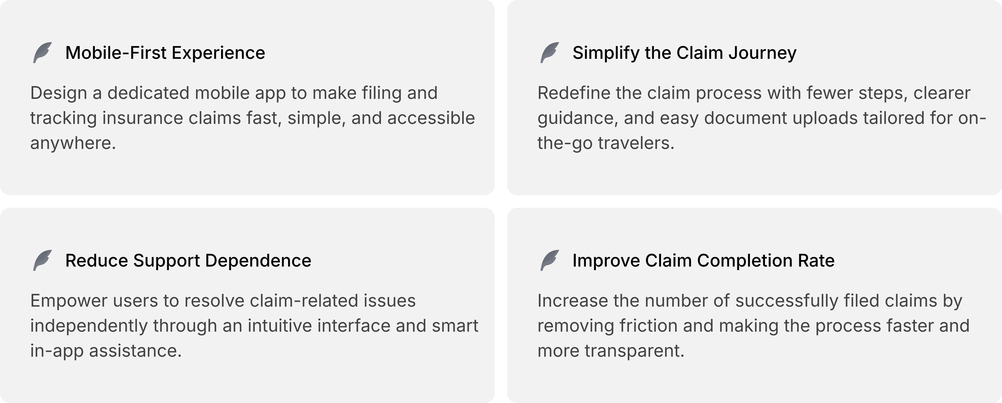
// goals
// Ideation & Design Exploration
After synthesizing research findings, I had a clear picture of the problems. Now came the critical question: How do we redesign an 6-step claim process to work for stressed traveler's in emergency situations? I began by translating research insights into design principles and "How Might We" questions to guide ideation:
How might we reduce cognitive load for users in crisis?
How might we eliminate the need for passwords during emergencies?
How might we make document upload effortless?
How might we help users file multi-category claims without confusion?
How might we build trust through transparency and communication?
How might we make the form accessible to elderly users?
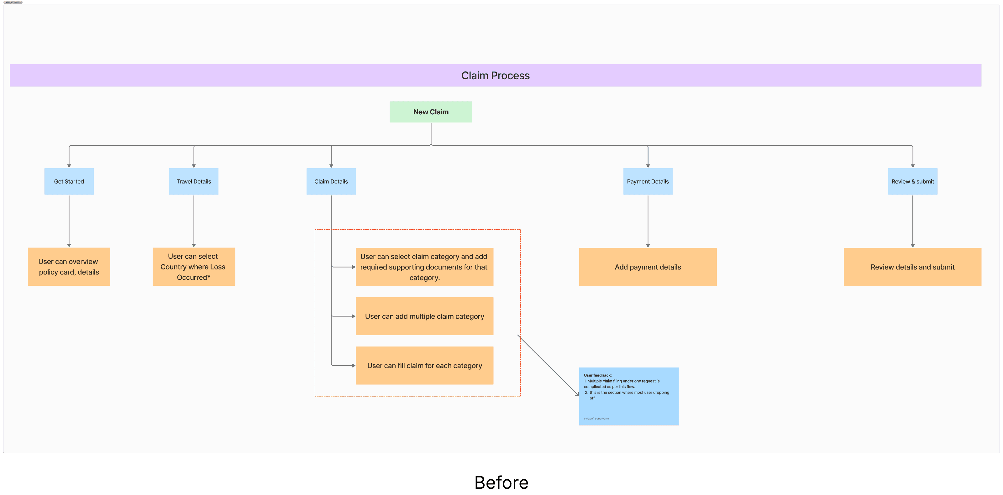
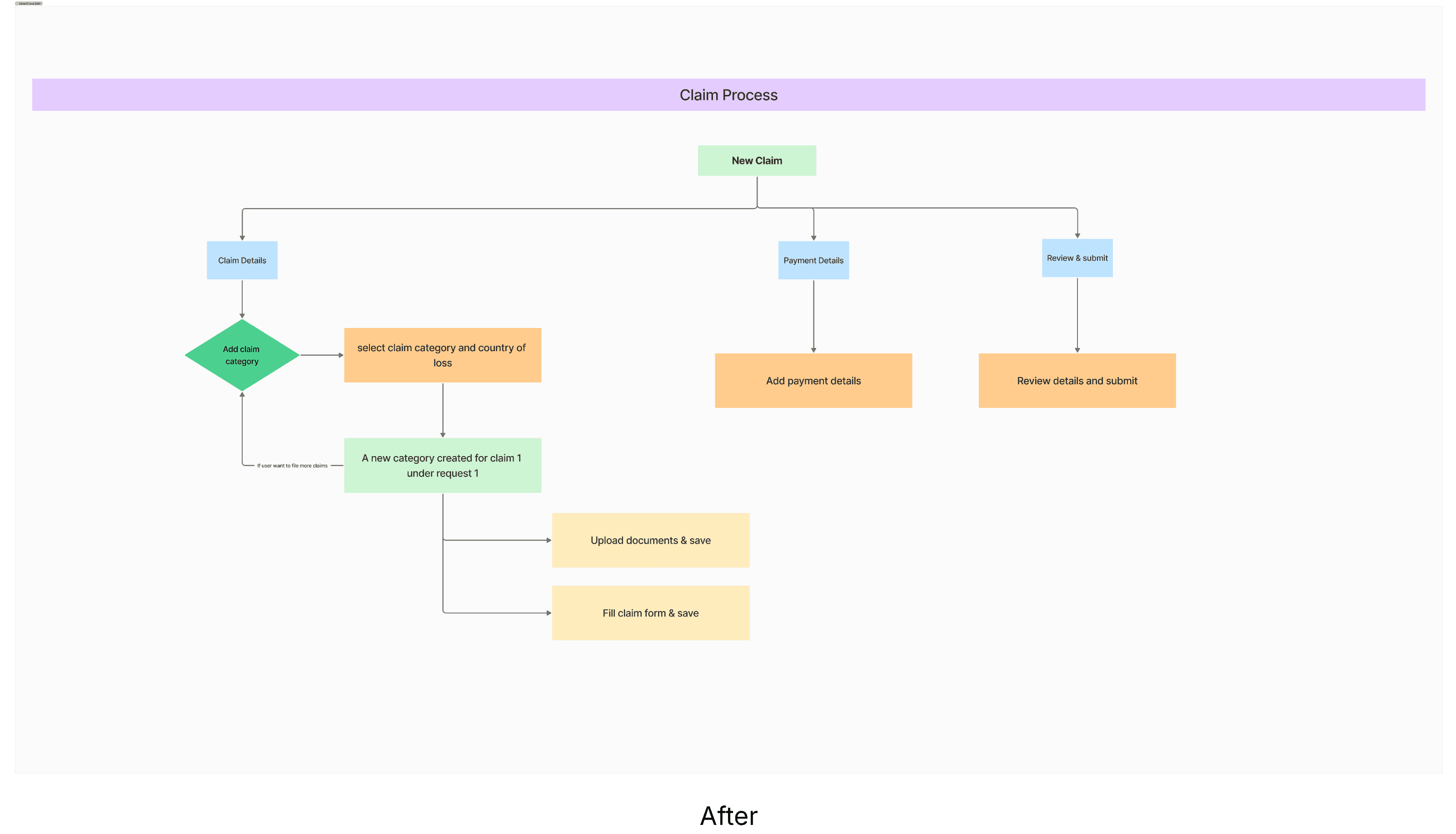
// Mapping User Flows
After synthesizing the research findings, I mapped the existing 6-step claim journey into a detailed user flow to uncover friction points. Once the gaps were clear, I created a redesigned flow that simplifies decision-making, reduces cognitive load in emergencies, and aligns with the new design principles.
// The solution
With user flows in place, I began designing wireframes. Red Dot Innovative aimed for a quick launch, so I adjusted my process to meet time constraints. After conceptualisation, I created the first draft of designs, built prototypes, and sent them for feedback and internal QC testing.

// Validating with Usability Testing
We conducted an initial round of moderated usability testing using a first-draft prototype with members of our internal team. This helped us uncover major usability gaps before involving real users. Internal testing helps identify clear usability problems, before involving real users. This avoids wasting participants’ time on issues we could fix ourselves.
// Redesign after first review
I refined the prototype based on the issues uncovered during the testing.
// Learnings & Reflections
Starting with support tickets and analytics before primary research gave me a solid foundation and helped me ask better questions in user interviews.
By designing for emergency contexts, I created a system that was delightful for ALL users, even those in ideal conditions.
Reducing 5 steps to 53wasn't just "nice to have" it was the primary driver of success. Every removed field, every eliminated click, directly impacted business metrics.